A founder's story
We went looking for a real, verbatim, sourced quote from a named subscription box founder describing this specific moment: watching a customer cancel not because of a bad experience they complained about, but because the box quietly missed their taste and they never said a word. We checked Shopify Masters and My First Million episode transcripts, Starter Story interviews, Indie Hackers threads on subscription commerce, r/subscriptionboxes from the operator side rather than the subscriber side, and founder threads on X tied to known boxes in food, beauty, and specialty goods.
What turned up was a lot of founders talking about curation strategy, how they pick products, how they source for a theme, after they'd already built a process around it. What we couldn't verify was a specific, attributable, sourced quote about the churn moment itself, the silent cancel after a box that missed.
So rather than inventing a quote and attaching it to a real name, here's a composite: a pattern that shows up repeatedly across founder interviews about running a curated or surprise-format subscription business, not tied to any one person.
A founder running a monthly surprise box checks the dashboard on renewal day. Most months, the numbers look fine, a handful of new subscribers, a handful of cancellations, nothing alarming in isolation. What doesn't show up anywhere is which cancellations trace back to a specific box. Nobody emailed to complain that the box skewed too sweet, or too niche, or missed the theme they'd hoped for. They just didn't renew. The founder can see the churn number. They can't see the reason, because there was never a moment where the customer had to say it out loud.
That's the shape of the problem even without a name attached to it: the box model produces a kind of churn that never generates a support ticket, which means it never generates a signal either.
Elaborating the pain
The surprise is the product. Nobody subscribes to a mystery box wanting to know exactly what's coming every month, that would just be a regular purchase with extra steps. The appeal is the reveal itself, the small moment of not knowing.
That same mechanic is also the risk. A regular product has a listing, a photo, reviews, a return policy the customer read before buying. A surprise box asks for trust upfront and settles the bill after the fact, when the box lands and the customer either likes what's inside or doesn't. There's no moment for them to opt out of a specific box before it ships, because by design they weren't supposed to know what was in it.
This is what makes the churn hard to catch. An angry customer generates a ticket, a return request, a one-star review, something a team can read and respond to. A quietly disappointed customer generates nothing. They open the box, feel a small letdown, and by the time the next charge date rolls around, they've already decided, without ever telling the brand why. The brand sees a cancellation with no context attached, and no context means no fix.
"Just curate better" is the instinct, and it's not wrong, but it's not sufficient either. Even a well-run curation process is guessing at scale, one box has to land reasonably well across a subscriber base with different tastes, and the format is fundamentally a bet made on the brand's behalf, not the customer's. Better curation lowers the miss rate. It doesn't eliminate it, because a blind box, by definition, can't be personalized to the one thing that actually varies from subscriber to subscriber: what they specifically wanted this time.
What a solution could look like
There's a real range of how brands handle this, and each option solves a different piece of the problem, not all of it.
No preview at all is the default for most surprise-format subscriptions, often a deliberate choice to protect the reveal rather than laziness. The cost is that every miss becomes a silent one. The customer's only two options are like it or don't renew, with nothing in between.
An occasional "sneak peek" post on social media, a story teasing the theme a few days before boxes ship, is common and low-effort. It builds anticipation for the subscribers who happen to see it. It doesn't reach the ones who don't follow the account closely, and it gives no individual subscriber a way to act on what they see, no skip button attached to the post itself.
A subscription platform's built-in skip feature (most major platforms have one) solves the mechanical half of the problem. A subscriber who wants to skip a month can, technically. What it doesn't solve is discovery: nothing proactively tells them there's a reason to consider skipping this particular month, so the feature sits there unused by anyone who isn't already checking their account on their own initiative.
A fully custom automated cadence, a short sequence of messages before each box ships that builds anticipation and gives a clear, timed opportunity to skip, is the version that actually connects the two halves: communication and action. It's covered in the next section. It takes more effort to build and maintain, and it isn't automatically better than the other options for every brand, but it's the only one that pairs "here's what's coming" with "here's your window to opt out" in the same message.
The solution we'd build
Here's how we'd build this if we were setting it up around a brand's actual shipping and billing schedule rather than sending on a fixed calendar date that may or may not line up with when the charge actually happens.
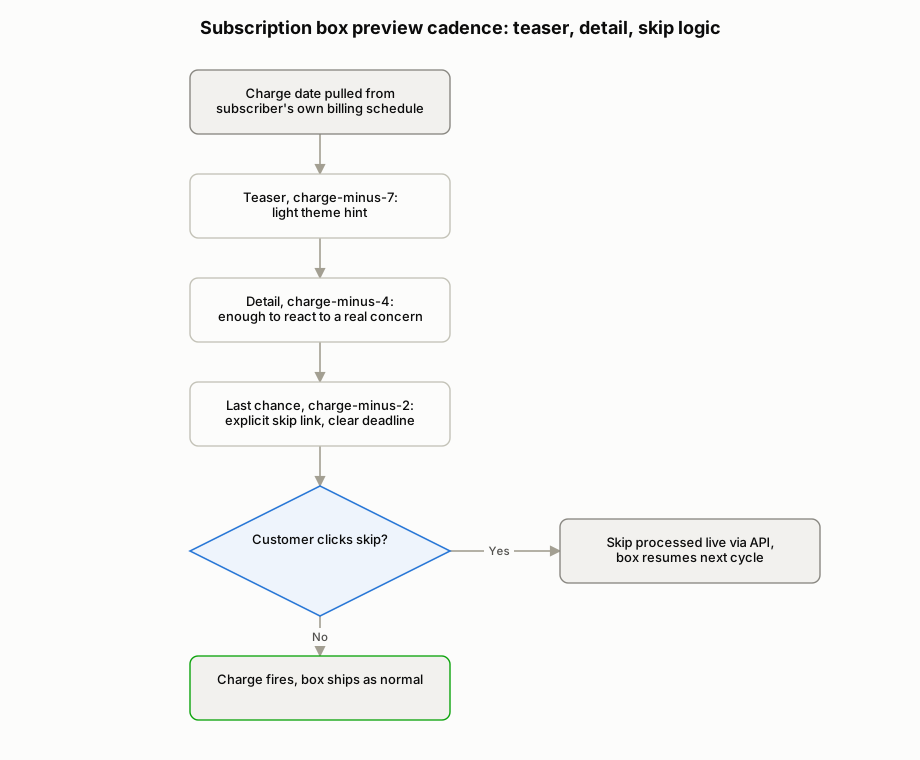
The anchor point is the charge date, not the ship date, because the skip window has to close before the charge fires, not after. Everything in the cadence gets scheduled backward from that date, pulled from the subscription platform's actual billing schedule for each subscriber rather than a single assumed date for the whole cohort, since staggered billing means not everyone's window is the same.
First touch, roughly a week out: a teaser. Light on detail, built to build anticipation rather than spoil the reveal entirely, something closer to a theme or category hint than a full contents list. This is the message that should feel like part of the experience, not a warning.
Second touch, a few days later: more detail. Enough that a subscriber with a real allergy, a strong dietary restriction, or a taste they've already told the brand they don't enjoy has something concrete to react to, without fully flattening the surprise for everyone else who's happy to wait and see.
Third touch, the last-chance message, timed to land with enough runway before the charge date that a skip actually processes in time, not the same day the charge fires. This is the one message in the sequence that has to be unambiguous: here's your box, here's your skip link, here's exactly when this stops being an option.
The skip action itself should be one click, no login wall, no support ticket required, resolving straight against the subscription platform's own pause or skip API rather than routing the request to a person who has to action it manually before the charge runs. Any friction here defeats the purpose: a skip link that requires three more steps just becomes a support ticket with extra delay.
Pros and cons
The upside is real: a subscriber who's on the fence about this particular box gets a chance to skip it instead of enduring a miss that quietly counts against the brand at renewal time. Skip beats cancel, because a skip keeps the subscription alive for next month, while a cancellation ends it outright.
The cons are just as real, and worth stating plainly rather than glossing over.
Revealing contents ahead of time can undercut the actual appeal for subscribers who specifically want the blind reveal. Some percentage of any surprise-box audience joined precisely because they didn't want to know in advance, and a detailed pre-ship email is, for that subscriber, a small erosion of the thing they're paying for. There's a real tension between protecting the surprise and giving people an informed opt-out, and no cadence design fully escapes it, only manages it.
Too many pre-shipment emails can become a churn trigger in their own right. A three-message sequence before every single box, month after month, adds up, and email fatigue is a well-established reason subscribers disengage in email marketing generally, though we don't have a source that isolates the effect specifically for pre-shipment preview sequences. Sometimes the disengagement hits the list rather than the subscription itself, which then quietly breaks the whole mechanism the next time it matters.
And this doesn't fix a box whose curation is genuinely misaligned with its subscriber base. If the product mix is wrong for who's actually signed up, a well-timed skip link just gives people a more graceful way to notice that repeatedly, month after month, until they leave anyway. A cadence like this reduces the damage from an occasional miss. It's not a substitute for getting the curation right in the first place.
How it gets implemented
The data source is the subscription platform's own shipment and billing schedule (Recharge, Bold, Skio, or whatever the brand runs on), read directly rather than estimated from a fixed monthly calendar. Charge dates vary by signup cohort, and any cadence built against an assumed single date will eventually send a last-chance email after the charge has already fired for part of the list.
Timing logic sits in an orchestration layer that calculates each subscriber's send schedule backward from their individual charge date: teaser at charge-minus-seven, detail at charge-minus-four, last-chance at charge-minus-two, or whatever spacing fits the brand's actual lead time between charge and ship. The exact offsets matter less than the principle: every send date is derived from that subscriber's real billing date, not a shared assumption.
The skip action needs a live, working integration into the subscription platform's own pause/skip endpoint, so a click in an email resolves immediately against the real subscription record, not into a queue someone checks later. A skip that doesn't actually register before the charge runs is worse than no skip link at all, because it creates a customer who did the right thing, on time, and still got charged.
What still needs a human: deciding how much detail actually goes in the second-touch email (that's a brand and product call, not something the system should be making alone), reviewing skip rates by cohort periodically to see if a particular product line is driving a disproportionate share of skips, and watching unsubscribe and complaint rates on the cadence itself to catch the fatigue problem before it shows up as churn.
KPIs: the cost of the pain, and the cited improvement
The clearest documented number here comes from Swell's 2026 research on subscription box statistics: 1 in 3 subscribers adjusted an order instead of canceling outright in 2023, skipping a delivery, swapping products, or changing frequency.
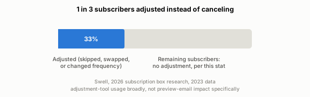
It's worth being precise about what that stat actually measures, because it's easy to overstate. It's an adjustment-tool usage number, broadly scoped across subscription commerce, not a measurement of preview emails specifically, and it's documented in food and beverage rather than across every category. We haven't found a verified stat that isolates preview-email impact on its own, so we're not going to state one.
What the stat does support is the underlying logic, not a specific outcome number: subscribers who are given an adjustment option before a charge use it, rather than jumping straight to cancellation. A preview-and-skip cadence is one way to make that option visible and timely instead of buried in an account settings page nobody checks. Whether it moves a given brand's numbers by any particular amount isn't something we can cite, only argue from the shape of the existing data.
Where this shows up
Documented in food and beverage, and it's specific to the subscription-box model in a way most automation patterns aren't: it only matters where the contents are genuinely unknown to the customer in advance. Any brand running a curated or surprise-format subscription, snacks, beauty samples, specialty goods, is running the same risk, and the same reasoning applies directly, even without category-specific data to back it yet.